React Native Starter Tutorial
Created for CSE 370
Getting Started
Part 1Part 2
Part 3
Part 4
Part 5
Part 6
Conclusion
Extra Help
Creating a new PageAdditional Resources
Managing State in React NativeReact Native Documentation
Expo's React Native Tutorial
The homepage
Lets display a post
In the final “here’s some code” section of this tutorial, we’ll start creating a basic homepage. When we first open the HomeScreen.js we will see an old component containing an image and some basic text. Let’s replace this component with a class based component, you can follow the below structure:
export default class HomeScreen extends React.Component {
  constructor() {
    super()

    console.log("HI! I need some state here so I can show lots of posts!")
  }

  render() {
    return (
      <View style={styles.container}>
        <ScrollView style={styles.container} contentContainerStyle={styles.contentContainer}>
          <Text>Hi</Text>
        </ScrollView>
      </View>
    );
  }
}

HomeScreen.navigationOptions = {
  header: null,
};

const styles = StyleSheet.create({
  container: {
    flex: 1,
    backgroundColor: '#fff',
  },
  contentContainer: {
    padding: 20,
  },
});
I have included a few components to help us get started, as well as some basic styles.
Now, we need a way to display posts on our homepage. There’s multiple ways to do this, and you’re welcome to customize it how you please (as long as it makes sense) for this project. However, we will be displaying posts in “cards”.
Let’s start off by replacing `
<View style={styles.card}>
  <Text style={styles.cardTitle}>Card Title</Text>
  <Text style={styles.cardDescription}>Card Description</Text>
</View>
Here we are making a new view with two Text components inside. We’ll be able to style this View however we’d like! We’ve given it two style classes, so we should probably add those now!
Add the following styles to the stylesheet object:
  card: {
    width: '100%',
    shadowColor: '#000',
    shadowOffset: { width: 0, height: 2 },
    shadowOpacity: 0.5,
    shadowRadius: 2,
    elevation: 2,
    backgroundColor: 'white',
    padding: 10,
    marginBottom: 10
  },
  cardTitle: {
    fontSize: 20,
    marginBottom: 10
  },
  cardDescription: {
    fontSize: 12
  }
Here we’re adding styles for card, cardTitle, and cardDescription. This will give us a nice base UI to work with.
It’ll be up to you to load in more cards from the API (you can use fetch just like in the web project), as well as add some features that are listed in the project description!
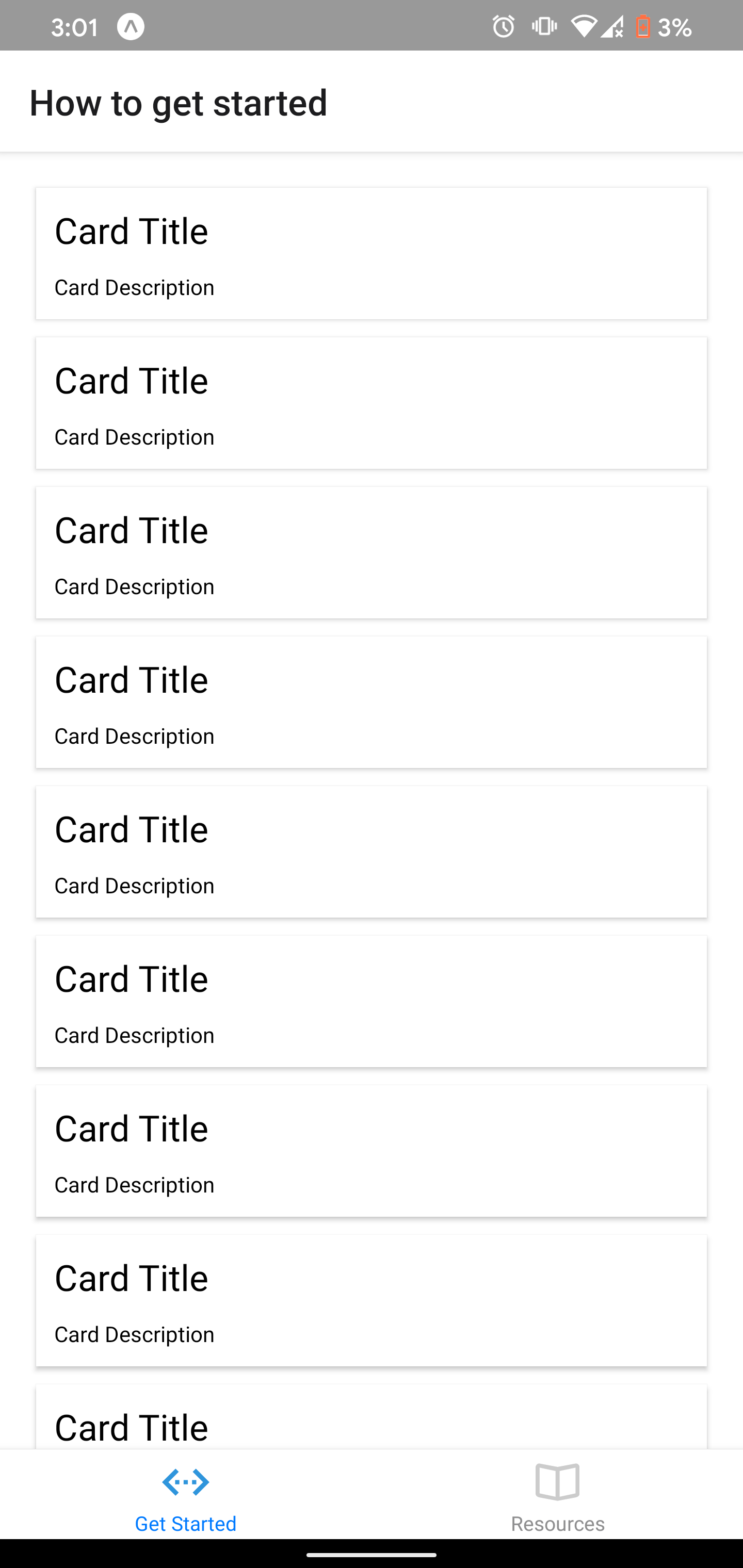
In the end when you pull in multiple cards, you’ll have something that looks like this!
