React Starter Tutorial
Created for CSE 370
Getting Started
Part 1Part 2
Part 3
Part 4
Part 5
Part 6
React Routing
Styling the navbar
Part 9
Part 10
Part 11
Part 12
Part 13
Part 14
Conclusion
Additional Resources
W3Schools React TutorialOfficial ReactJS Tutorial
ReactJS Documentation
Login and Signup
Finishing the register component
Right now, the register component that we built just renders a div tag with the word “register” inside of it. We want to actually render a form that can be used to sign users up for this app. Below is some code which will render a simple html form.
import React from 'react';

import './register.css';

class Register extends React.Component{

    render(){
        return (

            <div className="form">
            <h1>Register</h1>
            <form>
            <label> Username</label>
            <input type='text'></input>
            <label> Email</label>
            <input type='email'></input>
            <label> Password</label>
            <input type='password'></input>
            <label> Verify Password</label>
            <input type='username'></input>
            <button>Submit</button>
            </form>


        </div>

        );
    }


}

export default Register;
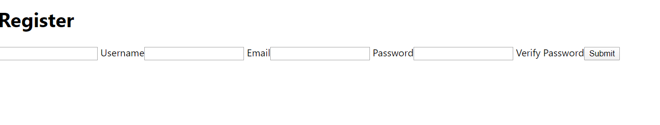 You should see something that looks roughly like the image above. Right now things look a little weird, so we’re going to add some CSS to make the form a little more comfortable for the user. Create a new file called register.css and import it into register.js just like we imported navbar.css.
import './register.css';
Now, we’re going to add some styling inside the register.css file.
.form{
    margin: 0 auto;
    width: 50%;
}

input{
    width: 100%;
}

button{
    display: block;
}
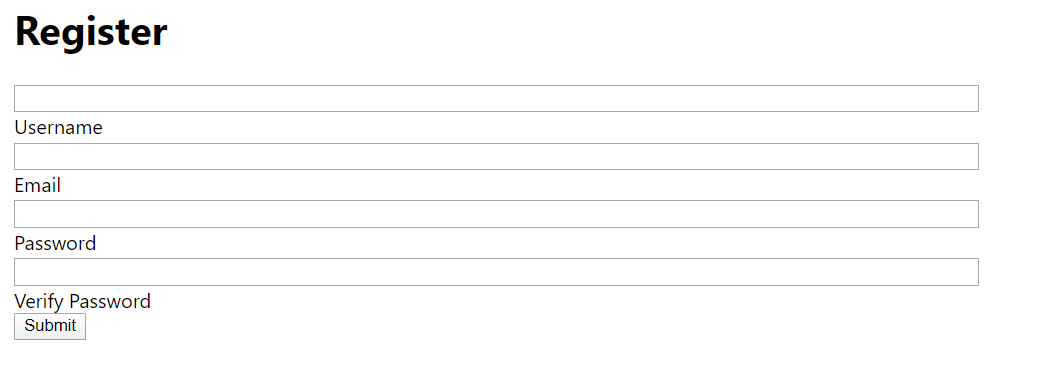
Now the form should be looking a lot better. The styling inside the .form class is going to put the div in the center of the page. We’re setting its width to 50% and the margin 0 auto is going to make it the middle 50%. We then specify that each input tag takes up 100% of the div containing it. Finally, the button is styled to have a block display so that it takes up its own row.
Things are looking better, but there are still some spacing issues. Everything is bunched up and the button is sort of plain-looking. Let’s add some more styling to enhance this look.
.form{
    margin: 0 auto;
    width: 50%;
}
label{
    font-size: 18px;
}
input{
    width: 100%;
    margin-bottom: 10px;
    height:30px;
    border: 2px solid blue;
    border-radius: 4px;
    font-size: 20px;
}

button{
    display: block;
    width: 50%;
   padding: 5px;
   font-size: 20px;
   border-radius: 10px;
   color: white;
   background-color: blue;
}
Now our form looks a lot better. First, we made the font bigger for almost everything. We then rounded the edges of our button and input by using border-radius